Copperhead Gin
Client
Liquor Manufacturer
Year
2023
Collaborators
Brian Boyd, David Wolske
Focus
Packaging/ Brand Identity
This assignment called for the rebrand of and packaging design for Copperhead Gin. Copperhead Gin was a unique client as liquor packaging is an intimidating task. Consumers often choose this product by selecting the most beautiful packaging on the shelf and there is a lot of existing work that I admire.
Logo
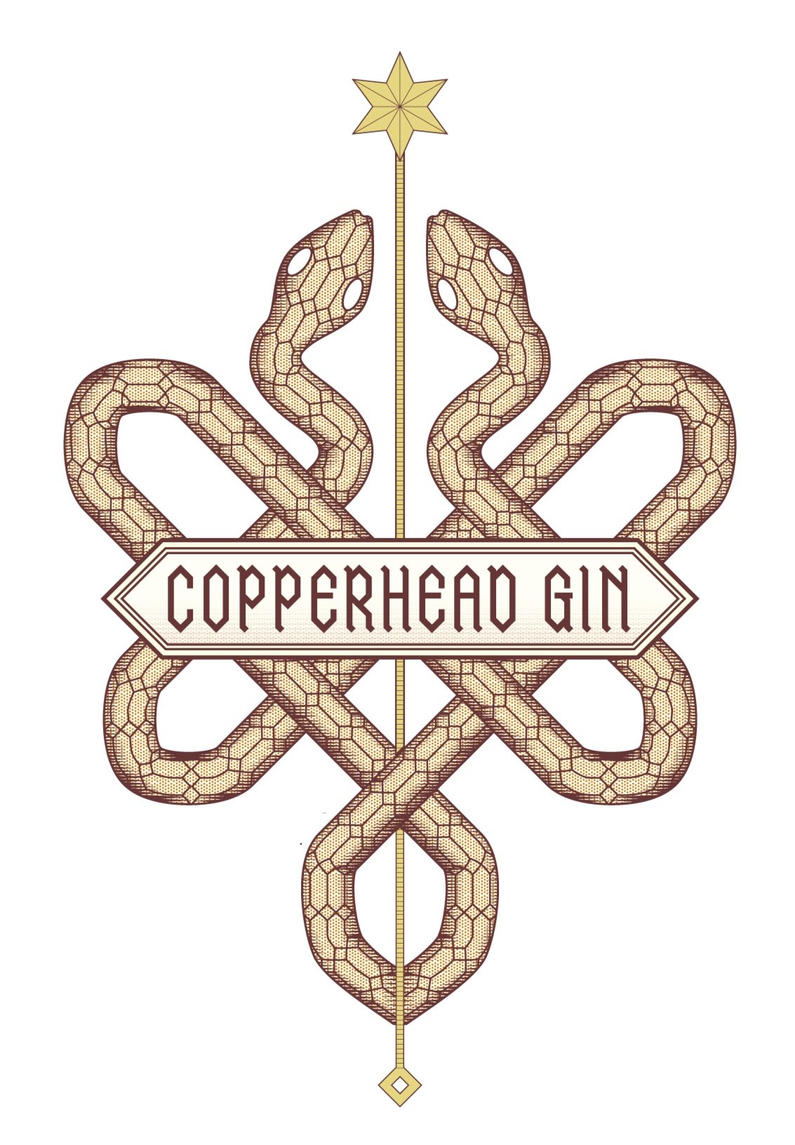
After studying successful competing brands, as well as the one I would be redesigning, I decided that the best course of action would be to design a sort of seal.
Copperhead Gin was founded on the medicinal history of the drink, and its current mark utilizes an intricate iteration of a medical seal.
I felt it wise to remain true to that part of their identity and explore ways to expand on this concept. I redesigned a logo with snakes intertwined around a staff.
I was able to echo the sharp, scale pattern in the positioning and posture of the snakes, as well as my type and its frame to create a solution to better represent Mr. Copperhead.
Box
When designing the box, I was intentional with remaining consistent with my system of pulling from the geometric shapes in the snake skin pattern. These forms are used to construct the shape of the frame, as well as all smaller ornamentation inside.
Packaging Design
The box highlights the relationship between the logo and bottle, utilizing intricate ornamentation and pleasant type.
Bottle
I explored bottle construction that mimicked the layered snakes and staff of the logo.
Box Ends
The star and block on the ends of box reinforce the relationship between the box and bottle designs.


